By Ryan Grewal,
Bulletin Correspondent

‘Violate any of my other advice before you be dull. If you’re dull, you’re signing your own death warrant. You’re telling people, “Don’t bother next time.”‘
—Ed Henninger, Director
Henninger Consulting, Rock Hill, S.C.
Although small publications often deal with issues more pressing than font choices or negative space, Ed Henninger, an independent newspaper design consultant, advised them to have aspirations beyond their modest circulation and find inspiration in the timeless designs of iconic magazines and newspapers.
“Look to the greats,” Henninger said. “I look to Elle Magazine if I want to get inspiration for typography, visuals, photos or just overall design.”
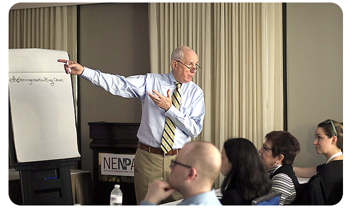
Henninger, director of Henninger Consulting in Rock Hill, S.C., outlined his guidelines for designing with limited resources in a spirited presentation titled “Designing your niche publications,” held Friday, Feb. 24, at the New England Newspaper and Press Association winter convention.
One of the most important elements of design for print publications is the nameplate, Henninger said.
“Create a great nameplate,” he said. “Not an ‘eh’ nameplate, not just one that’ll do, not one that has to go through a committee of nine people, seven of whom are visually brain-dead.”
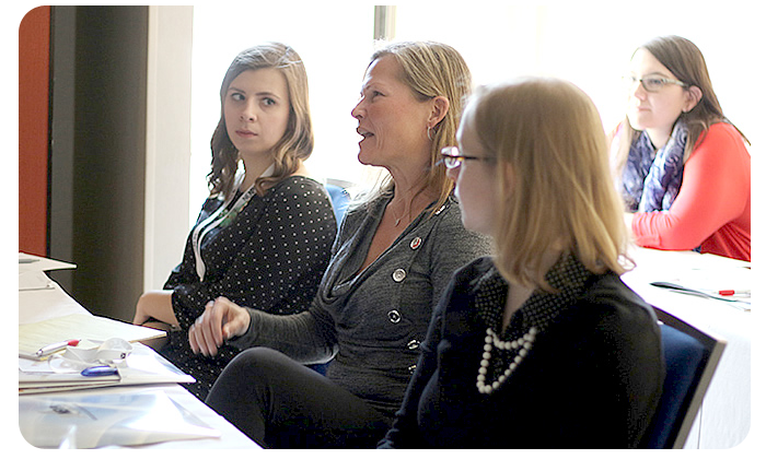
Henninger displayed examples of the nameplates of local niche publications, including Hartford (Conn.) Magazine, Marblehead (Mass.) Magazine, and Worcester (Mass.) Magazine. Designers and editors from some niche publications, including VT Ski+Ride magazine, based in Middlebury, Vt., and Stowe (Vt.) Guide and Magazine, were in the audience of about 25 people as Henninger critiqued their designs.
Niche publications often make the mistake of abandoning good nameplates in favor of seasonal kitsch, Henninger noted.
“Don’t think ‘Oh, it’s wintertime, let’s use that snow font,'” he said. “No, no, no, no, no. We’re not going there.”
In consulting for smaller newspapers and magazines, Henninger sometimes encounters misuse of formatting software.
“If I could have a cup of coffee with the guys who create (Adobe) inDesign, I would ask them to make an administrator-level inDesign so you can’t do things like squeeze type,” he said. “I’m dealing with a client now who sent me his inDesign pages … with headlines squeezed to 65 percent.”
Henninger’s session included a lengthy discussion of typeface choices, beginning with Henninger polling the audience on what fonts they use in their publications.
“Oh, wow, I’m really not happy to hear that (you use Arial),” Henninger told an audience member. “Arial is, to me, characterless and lifeless.”
He offered suggestions for different display typefaces, including Berthold Akzidenz-Grotesk.
“It is neither an accident, nor is it grotesque,” he said. “I’ve used it a lot.”
Closing out the session by noting his many pet peeves, Henninger advised the audience to remember the little things that improve the reader’s experience.
“Steve Jobs once said, ‘Design is not about how it looks, it’s about how it works,’” Henninger said. “Putting page numbers in the same place on every page is how it works.”
His biggest grievance is with dull design. The only unforgivable sin in newspaper and magazine layout is being dull, Henninger said.
“Violate any of my other advice before you be dull,” he said. “If you’re dull, you’re signing your own death warrant. You’re telling people, ‘Don’t bother next time.’ ”


