Ed Henninger
Design
ED HENNINGER is an independent newspaper consultant and the director of Henninger Consulting.
Website: www.henningerconsulting.com
Phone: (803) 327-3322
WANT A FREE evaluation of your newspaper’s design?
Just contact Ed: edh@henningerconsulting.com | (803) 327-3322
IF THIS COLUMN has been helpful, you might be interested in Ed’s books: “Henninger on Design” and “101 Henninger Helpful Hints.” With the help of Ed’s books, you’ll immediately have a better idea how to design for your readers. Find out more about “Henninger on Design” and “101 Henninger Helpful Hints” by visiting Ed’s website: www.henningerconsulting.com
Many community newspapers put strong effort into covering high school sports. They understand that their high school teams are a key ingredient in the glue that holds the community together.
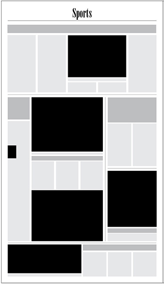
When designing their sports front page, however, many sports editors try to give all sports fair play. By doing so, they often create pages much like example #1 illustration.
There’s only so much space on their front page (and sometimes less, to allow for ads), and they cram in too many photos. As a result, none of the photos is large enough to be the lead visual.
When too many photos of like size are placed on the page, it’s difficult for readers to know which of the packages is more important. There’s no focus — each package calls for attention with the same “visual volume” as those around it.
What’s the lead? What’s the second most important report? What’s the third, and so on? Readers get no sense of hierarchy on a page with four or five like-sized photos.
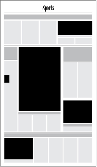
Example #2 works much better. It immediately gives readers a sense that the larger photo is part of a lead package. The other photos are no more than half the size of the lead photo, helping readers to understand that those packages are not as important as the lead report.
I appreciate that sometimes it’s difficult for us to decide which is the lead item. What if the boys basketball team just lost in overtime to their cross-county rivals, but the girls volleyball team won a squeaker over the same cross-county school? Hmmm … which gets the lead? Well, there you might have to rely on the better photo. If the picture shows the winning spike by the girls volleyball team, I’d want to make that the lead.
Another point: You can’t make everyone happy.
I recall a sports editor years ago asking me: “I report on three high schools. Can you design me a front page that gives them all equal play?”
I thought that over for a moment and responded: “Yes, I can … but I won’t.”
“Why not?” the editor asked. “If I don’t try to give them equal coverage, I get calls from upset parents.”
I answered: “You’re the sports editor. You’re paid to handle those calls. What if one of the teams you cover has a record of 11-1 and the other two are 3-9 and 2-10? Do you really think it’s good journalism to give them all the same space?”
When I shared that story with the publisher, he just shook his head, grinned and said: “Yeah. That’s Bob.”
Don’t be Bob. Make choices on your sports front. And let the photos guide you to making choices that will help your readers.
Sports page example #1

Sports page example #2

